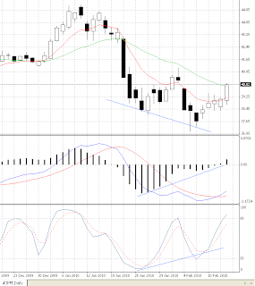
First the daily graph of Bank of America (BAC). What is clearly seen there is the bullish divergence between the price and the indicators (marked by the blue lines on the graph). Given that configuration yesterday's jump in the price was no surprise. The volume is around the average for the stock and still a bit higher than the several previous trading days. What keeps the warning sign on the above graph is the Moving Averages configuration which are in a negative formation. So let's look at the weekly graph.
The given divergences on the daily graph combined with the weekly graph where the stock looks a bit oversold could lead to a further advance in the price at least in a short term. If the price follows such a scenario the first possible level could be around $15.70 where is the MA30 on the weekly graph. If that gets broken the weekly graph will also have a positive formation and the price could advance to $18.40 where is the MA30 on the monthly graph and a resistance level for several times during the past months.
J. P. Morgan (JPM)
 The situation at J.P.Morgan & Chase (JPM) stock looks quite similar. The divergences are on but the Moving Averages still haven't crossed on the positive side. A bar that leads the price above the MA30 is very possible for today. The highest possible point could be the previous resistance level around $41.
The weekly graph is quite the same as the one of Bank of America (BAC) os it's not shown here.
The interesting thing in the graphs of the two banks comes from the monthly ones.
 They both look headed to being strongly oversold and still the MACD histogram stays on the positive side. A pointing up Stochastic would give more freedom to say a major upward movement has begun but it obviously has not. It might take a bit more time before everything is settled and these price levels are not seen again in the years to come.
Obviously the stocks of the two banks have different price behavior with the JPM being more stable and seemingly stuck between it's two moving averages. This however speaks nothing more than just giving a hint about how risky each of the positions is.
Citigroup (C)
The same formation on the monthly graph is seen on the Citigroup (C) graph. It more closely resembles the BAC monthly one which is normal as both banks were perceived as troubled ones during the crisis.
 Citi however still lacks major institutional investors in their base. This has both positive and negative impact on the stock. The small percentage of institutional holdings has helped keeping the price low compared to the BAC one. The good thin about that is that the low price attracts a lot of small traders. Such a price also minimizes the risk by the simple assumption that losing $3 per share is less than losing $15 per share. This all makes the stock being loved by daytraders. The notion that the stock is not so risky attracts a lot of optimism in the trading which on its turn (as being held mostly by the public) exhausts very fast and the buying power for the stock vanishes.
Still there are bullish divergences also seen on the Citi daily graph but they don't seem so obvious and clear as in the graphs of the other two banks. For the current upward movement to sustain it would be good to see the price goes (and closes) above $3.40/50 on the weekly graph.


No comments:
Post a Comment